Browsing Category

Architecture

The De Young Museum (1)

So much for good intentions. The plan for the de Young museum building to turn – literally – bright green in color within 15 years of its construction to mirror its park surroundings did not pan out. What happened?

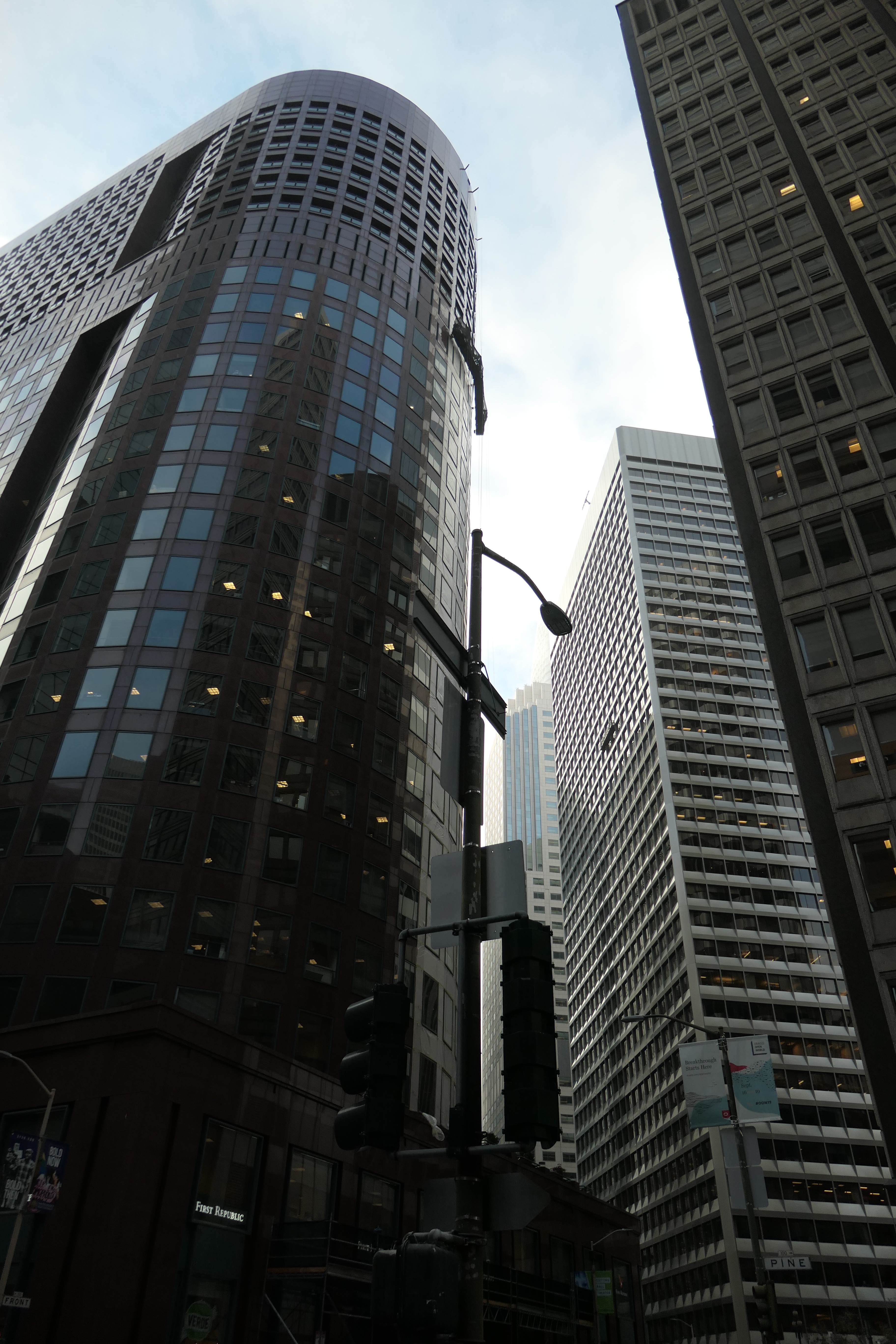
After the famous San Francisco art museum was damaged beyond repair in the 1989 earthquake, two star architects, Jacques Herzog and Pierre de Meuron (think Tate Modern, Great Britain) were eventually called to create something truly new. Which they did. A stunningly different – and gorgeous – construction with a physical presence that both integrates into and dominates its lush physical surrounding, with an elongated rectangle (linked smaller pavilions inside) echoing the shape of Golden Gate Park, and a high tower reminiscent of the tall trees that are the park’s hallmark.

The building’s full 293.00-square-feet facade is covered in copper panels which were supposed to develop a green patina over the years. Given the increasingly dry climate, that process is now expected to take about half a century. Instead you see a rusty brown color – the color of coconuts I thought, a thought probably suggested by the majestic Canary Island palms that flank the building. A thought that would be a mistake.

These palms are from the date palm family, a very different species than the ones carrying coconuts. They are as stately as the tower behind them. They also let the light percolate through their foliage just like the light on the museum seems to be dappled, due to the patterning of the copper skin, at times perforated, or dotted, or structured in other ways. That pattern also picks up the rough structure of the palm tree trunks. I could not think of a cleverer way to reflect the beauty and specifics of an environment in modern architecture.

To the right of the building (I came too early for the official sculpture garden on the left to be open and did not enter any building due to Covid-19 risks) is The Garden of Enchantment, displaying a strange assortment of sculptures.

Moody sphinx (Arthur Putman (ca. 1910)

join an overwrought Gustave Doré contraption, Poème de la vigne (Poem of the Vine) (1877–1878, cast in 1882). Why do his sculptures so often remind me of misshapen, marzipan-encrusted wedding cakes?

Diverse wildlife crouches in the vegetation,

lorded over by a shiny silver pirate by Peter Coffin, “Untitled (Pirate)”, 2007, (cast in 2009,) who comes in pairs – pairs of hooks, peg-legs, parrots and eye-patches,

blind to the saccharine figures in front of him, probably for the better.

According to the artist,

“I believe the spirit of San Francisco still embodies the ideas of ‘the West,’ where dreams come from, where the frontier expands to the ocean, etc. That sense … is closely tied to its unwillingness to be restricted, its history of resistance and its fight for freedom against authoritarianism.”The pirate should stand “strong as a timeless hero or anti-hero here to defy authority and the status quo, he lives apart from the conventions of bourgeois society and breaks the rules to make new ones.”

Funny, that in Gardens of Enchantments those very conventions always prevail, with empty promises of happy endings….

Has me scratching my head as well….

Arthur Putnam, Cave Man (1910)

More on the museum and its surrounds tomorrow.

For music today I chose a group that has performed at the de Young in the past with a piece that matches the energy of the building.

Antidote

I, for one, find the kind of hedging, waffling, side-stepping, equivocating, prevaricating, stalling and evading we have witnessed in the last few days of the Supreme Court Confirmation Hearings plainly poisonous. And may I remind all of us, that psychologists consider omissions, restructuring, denial, minimization or exaggeration a form of lying.They do speak to the character of those engaging in these actions, or shall we say the absence thereof, but they bring about malaise nonetheless, given what is at stake and given that the absence of character will not matter one bit when it comes to the votes.

Let me post an antidote – words that are unequivocal, honest, no holds barred, emphatic and firm. Words that were true then and are now.

Photographs are of the Martin Luther King, Jr. Memorial in Yerba Buena Gardens, right in the center of San Francisco. The selection of his words is printed on glass plaques and placed behind a gorgeous waterfall.

I will report more on the gardens tomorrow, not wanting to dilute the power of the words displayed above today. But here is the blurb about the memorial from the website:

The vision of peace and international unity is enshrined in this memorial featuring a majestic waterfall and shimmering glass panels inscribed with Dr. King’s inspiring words, poems and images from the civil rights movement. Artist and sculptor, Houston Conwill, created this memorial in collaboration with poet Estella Conwill Majoza and architect Joseph De Pace.

What are days for?

Today is my son’s birthday, he’s still in his 20s. As we are living through day after day after day filled with medical challenges and untreatable pain, the question or, really, assertion posed by Philip Larkin of where can we live but days has taken on a new quality.

Larkin was a lugubrious sort, in addition to being often misogynistic, racist, xenophobic, smutty, sarcastic and generally unpleasant. (Read Andrew Motion’s Biography Philip Larking: A Writer’s Life if you don’t take my word for it.)

But, oh, did he know how to put a finger on exactly the spot where we, in grief or fear or need, end up asking ourselves, “Now, what?” And with insights softened by wit, he made clear that we face but the choice to muddle on. Or through. Happiness/Schmappiness – the routine of the days, their inevitable structure around burden, will carry us, lest we consent to sink into madness or forfeit the will to live – psychiatrist and priests, in their flapping, ridiculous garments, not exactly to the rescue, haste notwithstanding.

I truly find the poem and its imagery uplifting, motivational in its acknowledgment that happiness – that strange promise – might still be attainable if we agree to be content with something different from what we had aspired to.

What are days for? They are for healing. For finding courage. For flexibility in the face of challenging times. Or so I tell myself, rather avoidant of the flappy coat professions.

Days

BY PHILIP LARKIN

What are days for?
Days are where we live.   
They come, they wake us   
Time and time over.
They are to be happy in:   
Where can we live but days?

Ah, solving that question
Brings the priest and the doctor   
In their long coats
Running over the fields.

Philip Larkin, “Days ” from Whitsun Weddings. Copyright © Estate of Philip Larkin.  Reprinted by permission of Faber and Faber, Ltd.

Photographs today are from San Francisco’s Palace of the Fine Arts. It was designed by Bernard Maybeck to exhibit European art at the 1915 World’s Fair, the Panama-Pacific International Exhibition celebrating the completion of the Panama Canal in an attempt to show the world that San Francisco had risen from the ashes of the devastating 1906 earthquake and fire.

It is a strange building, reminiscent of a folly (a costly ornamental building with no practical purpose, especially a tower or mock-Gothic ruin built in a large garden or park as the Oxford dictionary defines it) albeit a folly on steroids. Larkin would have had a run with it. Meant to evoke a ‘sad, minor note’ of ‘an old Roman ruin – now why would you want that for a celebratory world fair??? – the Rotunda featured numerous weeping women, their backs turned to the viewer, covering their faces in their hands. Sculptor Ulric Ellerhusen crated the melancholy figures to enhance the sense of mystery desired by Maybeck.

They were granted more days than they probably wanted – unless the fires of the homeless, still smoldering when I visited in early morning hours, get out of hand.

“…the Palace of Fine Arts was built for temporary use, and construction materials were chosen almost as if they were building a stage set. All the columns, figures, walls and entablatures were made of plaster.After the fair, when most other structures were destroyed, the Palace of Fine Arts got a pass from the wrecking ball.

It was saved by the Palace Preservationist League, founded by Phoebe Apperson Hearst, the mother of William Randolph Hearst. However, due to the weak materials it was made from, as the years passed, it became in desperate need of repair. In the 1960s it was completely reconstructed, using more lasting materials like concrete. And after seismic retrofitting was completed in 2009, it looks like these ladies will be weeping well into the future.” (Ref.)

The 1960s renovation almost did not happen – only after Walter Johnson, a philanthropist, stepped forward with a substantial 2 million dollar starting contribution did the city manage to secure bonds and the state added the rest to complete the 3 year renovation.

The weeping ladies had a reprieve – may there be happy tears within their days, at least on occasion.

Days are where we live – let’s not lose our heads over that.

Music today by Scriabin who died in 1915, a piece often heard in our household.

Fog Silver

When that thing formerly known as the sun reappeared on Sunday morning in my garden, it threw beautiful columns of foggy silver across trees and meadow.

Fairy slides we used to call them when the kids were little. Alas, current associations go to magical thinking of a different kind: the installment of a king, if not emperor, wishing for a return to neoclassical building styles emulating the architecture of Greece and Rome millennia ago with columns as tokens of power and order, linking the current regime to nasty ones before them.

It was, after all, Hitler and Mussolini, who appropriated the tradition and grandeur of neoclassicism to serve the Nazi image and reminded a fascistic Italy of the power of the Roman Empire. No surprise, then, that our dear leader is going for Dictator Chic.

But who will be his Albert Speer, the equivalent to Hitler’s main architect?

Speer was as nasty as they come, but able to escape a death sentence at the Nuremberg trials because it was not yet known when he was tried how deeply he had been involved in the Holocaust. After his prison sentence he was released in 1966 and lived a life writing successful books until the died in 1981. Here is historians Ulf Schmidt assessment.

“Speer was personally involved in the Holocaust, that his ministry provided the building materials for an extension of Auschwitz, that he made a substantial fortune with Aryanized property, denounced uncooperative competitors, initiated the construction of concentration camps, and supported the draconian measures used against forced and slave labourers in some of Germany’s most horrific underground production facilities. If only a part of this had been known during the International Military Tribunal in 1945, which preceded the trial against Karl Brandt and others, Speer would probably have been sentenced to death. The fact that most of it was unknown at the time gave Speer the possibility of creating his own carefully constructed, but also greatly biased, post-war narrative of himself and the regime, a convenient and plausible story, which scholars and journalists either took for granted or were unable to refute.”

And here is an incisive essay by Chimamanda Ngozi Adichie, on reading Speer’s Inside the Third Reich as a child in Africa, then re-reading it as an adult at Yale. “His rueful acknowledgment of his dedication to Hitler, and his philosophical puzzlement at his own complicity, seeks to cast a glaze of innocence over him.” Perhaps the kind of book a certain attorney general might write in the distant future?

Back to the white columns: it is not architecture per se that should be seen as the problem. As I learned here there were lots of good guys (relatively speaking) who used neoclassical styles in their capitals (Paris’ Pantheon, London’s National Gallery,) and lots of bad guys, who have used the most progressive architects and architecture to set monuments to themselves. These include monumental buildings in totalitarian states such as Kazakhstan and Azerbaijan, designed by progressives like Norman Foster and Zaha Hadid. Jair Bolsonaro from Brazil is apparently hiring the Danish star architect Bjarke Ingels.

The problem is the political process that seeks to reverse the Guiding Principles for Federal Architecture (with us for 60 years now,) which insisted that architects suggested the designs to the government, not vice versa.

Entitled “Making Federal Buildings Beautiful Again,” the draft of the executive order argues that the founding fathers embraced the classical models of “democratic Athens” and “republican Rome” for the capital’s early buildings because the style symbolized the new nation’s “self-governing ideals.”

Here are the details and also the reactions of various parties involved, including the resignation of the General Service Administration’s Chief Architect and Director of the Design Excellence Program, David Insinga, and the response of the American Institute of Architects.

“The AIA strongly opposes uniform style mandates for federal architecture. Architecture should be designed for the specific communities that it serves, reflecting our rich nation’s diverse places, thought, culture and climates. Architects are committed to honoring our past as well as reflecting our future progress, protecting the freedom of thought and expression that are essential to democracy.”

I believe proscribing certain styles of architecture is a statement of power, and an imposition of values associated with the style. It is not just a brand, it signals an ideology. If it is historically associated with authoritarian regimes by someone with authoritarian tendencies, we should be alarmed. Restricting creative freedom is just one more step in line of the developments we have seen over the last few years. We should march in protest columns, not have neoclassical ones stare in our faces.

Bruckner’s 4th symphony (a beautiful piece) starts with a sunrise, but since he was appropriated by the Nazis we’ll skip him. Let’s listen to this instead: Carl Nielsen’s Helios overture. Fittingly composed during a journey to Greece…

SoCal Adventures

Last week I visited Los Angeles for the first time ever. It was a fascinating experience, and so jam-packed during the 2.5 days I had there, that I will need all week to report about it. And probably a month to process….

One of the things known and indeed striking about LA is the sheer size. The land area of LA County is over 4000 (!) square miles and the population is over 10 million (over 4 million for the city proper) with individuals from around 140 nations and 224 specific languages (I didn’t even know that so many vernaculars existed…)

Since we are talking BIG, I might as well start with the largest art complex I visited, The Getty. I said complex, but am tempted to say compound: the many buildings housing the Getty foundation, the Getty Conservation Institute, the Getty Research Institute and the J.Paul Getty Museum sit on top of the hills above LA, occupying it like a fort.

The choice to build a major cultural institution on 240 acres of virgin land in the Brentwood neighborhood had its defenders and critics (including those who worry about environmental disasters, like the recent fires coming quite close, and the fact that access is quite limited for fire trucks.)

“Moving to the heights of Brentwood was brilliant, because the setting allows every visitor to rise above the heat, noise and traffic of the city and to concentrate on great art. It is, as museum director John Walsh puts it, ‘a democratic villa.’ “Or as another architect put it: “The Getty serves fundamentally as an oasis from the city which is increasingly congested, It’s a place in the middle of the city where you can get away from the city. That is something that occurs in other great cities.”

Alternatively….

Skelley, Jack. “Is it really “Your” Getty?: Architects and planners chide new aloof acropolis,” Downtown News (15 Dec. 1997), pp. 

The most outspoken review condeming the decision of the Getty trustees to locate on the Brentwood hilltop instead of in downtown Los Angeles. A local architectural critic is quoted as saying “I find the temple-on-the-hill-thing pompous, preposterous and pretentious beyond all belief. The desperately over-reaching ambition in this obscenely overpriced, over-designed and over-hyped project suggests a kind of arriviste insecurity in this adolescent institution.” More thoughtfully, a local architect writes: “A lot of us were deeply disappointed the Getty chose toplace themsleves as this remopte acropolis separated fropm the city. We all believed the Getty could have infused an extraordinary energy into Downtown L.A. bymaking an alternatyive choice.”

One might think of it in terms of who has the likely resources in this multi-ethnic city, including time, to visit. You have to drive out there (steep parking fees,) then take a little funicular (after bag search and waiting in line due to limited capacity of the tram) to the top where the complex unfolds. Entrance to the private museum is free, but the possibility of accessing art as someone who might skip lunch to see it is zero. It is for the privileged, who might not feel uncomfortable in what was calledthe command post of a multinational conglomerate.”

That said, honestly it is the most beautiful corporate headquarter you can imagine! It weaves buildings and public open spaces seamlessly together and makes them look good even when they were required for pragmatic other than architectural considerations (the size of the entrance plaza, for example was defined by the requirement for said fire trucks to be able to turn around.)

The modernist entrance rotunda is serene, and the enclosed courtyard a lively place with fountains.

The views of the city and the surrounding mountains from within the buildings and from the outside gardens are gorgeous.

The various parts of the whole are united in the use of similar materials, most prominently a yellowish travertine stone (brought in from Italy…) which catches and reflects light even on grey, rainy days like the one when I visited.

Richard Meier, the main architect of the Getty, is known for his use of the color white. LA passed legislation shortly after he had gotten the commission that prohibits white for some reason. The yellowish, light travertine was his alternative path. Here he is in an interview talking about the ten year process of building the complex, the way he aligned the buildings with the highways as a nod to LA car culture, and footage of the construction process. We will not go into the fact that he has been accused of multiple sexual harassments, had to step down from his architectural firm (although they lost NO clients after the news of settlements with alleged victims etc.) and now works as a “consultant.”

Most important of all, the galleries really serve the art well, natural lighting and placement superb (which you cannot say for the only other Richard Meier museum I know, the Museum für Angewandte Kunst in Frankfurt.

I saw two exhibits at The Getty on Friday, of which one left me cold despite its enticing title,

and the other will be celebrated in tomorrow’s blog.

And Music? Founded in 1939, Los Angeles’ Monday Evening Concerts (MEC) is one of the longest running series in the world devoted to contemporary music. The Getty often joins forces with MEC and had some months ago a concert featuring Steve Reich’s Drumming outside on the plaza during sunset. It must have been quite the experience. Here is an excerpt of the music by a home-grown PDX ensemble.


Bay Area Visions

Today I thought it would be fun to juxtapose the looming architecture of San Francisco’s Financial District with an extraordinary building I visited in Berkeley.

Here is a sampling of banks, consumer palaces, office towers and other oppressively imposing structures.

The Microsoft Building

Even the reflections echoed the massiveness.

And here, in contrast, is the 10 year-old David Brower Center, a beautiful green building that is home to the environmental movement and its allies.


It was named in honor of David Brower, an extraordinary rock climber and pioneer of the environmental movement – he founded Friends of the Earth and later the League of Conservation Voters – who was the first executive director of the Sierra Club. Many different organizations share the space.

The lobby branches into the light-filled Hazel Wolf Gallery devoted to art of advocacy, which currently shows The National Geographic Photo Ark led by photographer Joel Sartore.

*

The Necessity team was there to interview two lawyers from the Climate Defense Project who represent climate activists and also work as legal observers during demonstrations and other actions. Executive director Kelsey Skaggs and co-founder Alice Cherry are both Harvard alumnae and the 2018 Echoing Green Fellows of Harvard’s Public Service Venture Funds (PSVF) which provides seed funding for emerging leaders who are tackling the world’s most pressing issues.

Kelsey Skaggs
Alice Cherry

Among other things, the attorneys focus on the necessity defense, a legal argument used by people accused of acts of civil disobedience. It states that when all legal and political means are exhausted it might be necessary to engage in non-violent illegal action to prevent irreversible harm. You need to offer proof that harm was imminent, that the harm you inflicted does not exceed the harm that is potentially prevented, and you have to be able to show that all other attempts to stop the harm within our legal framework were futile.

Alice Cherry and Kelsey Skaggs in discussion with film director Jan Haaken

Here is a more knowledgeable and detailed description of the argument written by Kelsey Skaggs.

Given the threats that resource extraction entails for our climate, and the continuing inability to address industrial assaults on the environment within the usual frameworks of our law, this is the true vision, alluded to in today’s title.

Music today by John Prine, you can read about him here.

Art on the Road: Hudson Yards, NYC

Hudson Yards, the twenty-five-billion-dollar, twenty-eight-acre new development in what used to be the Meat Packing district is probably the most artificial site in all of New York, an unadulterated celebration of excess and greed.

New High Rises in and around Hudson Yard

As the New Yorker put it earlier in 2019 when many of the structures in this development opened: it’s the Hotel California of NYC.

It is a private space masquerading as a public one. It is the realized vision of one man, the developer Stephen Ross, the founder and chairman of Related Companies, who brought us the Time Warner Center a decade and a half ago. Ross, who will soon move into a penthouse at the development, calls his creation a neighborhood—“the neighborhood of the future,” in his company’s advertising lingo. In reality it is an enclave, a high-end corporate park buoyed by six billion dollars in tax breaks—an amount that dwarfs the subsidies offered to Amazon for its scuttled Queens headquarters—and designed as a kind of amenity-stuffed Hotel California that its residents never have to leave. (There are a limited number of so-called affordable units; in keeping with precedent in our city’s age of latter-day luxury, the people who live in them will have separate amenities, upstairs/downstairs style.) The only thing that Hudson Yards is missing is its own weather.

Views from the High Line towards the old Meat Packing District

The High Line, once an imaginative new urban park (although it gave real estate companies license to dramatically hike up property values in the Meatpacking District,) now seems like a walkway, filled with throngs of tourists, moving through this luxury neighborhood unstoppably towards the nouveau-riche shopping center at its end and a hollow folly placed in the middle of it all: The Vessel. If there ever was a perfect symbol for grifter capitalism: this is it.

The Vessel

Designed by Thomas Heatherwick, the close to $200 million structure sports staircases rising into the air 150 feet – going nowhere. I take that back, they afford you views of the shores of New Jersey, advertisements from the adjacent mall, and endless opportunities to take selfies (note the terms of service agreement, though, which granted The Vessel all rights to any photos, audio, or video you take at the structure–meaning the developer could use your likeness for any commercial activity forever.)

As a supposed public amenity it sure lacks places to sit, although climbing it is technically free. Clad in gaudy copper it also serves as an amenity for the neighboring luxury apartment buildings (condos start at $2 million). The website for one of the luxury towers, 1 Hudson Yards, highlights the fact that the building overlooks the Vessel as a prime reason for why someone should spend $9,000 per month in rent for a two-bedroom apartment in the tower. The Vessel gives Related built-in marketing.

No wonder New Yorkers call it the golden Shawarma, among others.

And no, I did not climb it.

*

Close-by is another architectural novelty: The Shed. The Washington Post‘s headline and attached article The-shed-is-the-only-reason-to-go-to-hudson-yards-new-yorks-most-hated-new-development captured it pretty accurately. Most people, of course, will walk by without a clue what this thing is or can do – “a boxlike form projecting out of the bottom of a high-rise residential tower, and a canopy with translucent plastic side panels, mounted on wheels and rails, that opens onto a public plaza. When the extension canopy is open, it incorporates a huge volume of temporary space for performances. A bit of leavening in this whole miserable, embarrassing tale of urban gigantism and one-percenter excess.”

High Line approaching the Shed

Built at industrial scale, with industrial elements, it includes six-foot-wide steel wheels that carry the 120-foot-tall canopy along the rails, like the giant cranes that load cargo ships in a modern seaport. Clad in pillows of synthetic material that mimic the thermal properties of glass (with a fraction of the weight), the Shed, when open, encloses some 2 million cubic feet of interior space and can accommodate up to 3,000 people when the inner galleries are configured for expanded seating.

*

Earlier in the day, I had marveled at bunnies. Well, marvel is perhaps the wrong verb. I had wracked my brain about who would buy these ceramic sculptures (larger than life by a factor of multitudes,) priced between $14.000 and $28.000. They were on exhibit at Dienst&Dotter Antikviteter, a store specializing in Scandinavian antiquities and art. The work, titled A Place behind the Oaktree is by Margit Brundin, who is an accomplished Swedish ceramicist (with a MFA in ceramic arts from the University of Goethenburg) whose work is in collections of the National Museum in Stockholm, the Röhsska Museum in Gothenburg and others.

Margit Brundin Stargazer
Margit Brundin Watching You

The workmanship impressed, the whimsical quality appealed. The sculptures are built in a three-monthlong process from red stoneware clay and coil construction. The forms are painted with liquid clay colored with oxides like copper, iron, manganese’s and cobalt, capturing light that hints at movement. If only she’d had abstained from the anthropomorphizing…. Rolling tears, facial expression, references to Narcissus at the pool – why imbue the hares with human qualities, when a plain description of the beauty of nature via that terrific accumulation of her skills as a ceramicist and her artistic eye would have sufficed?

Margit Brundin Lean on Me
Margit Brundin Silent Conversation
Margit Brundin Mirror Mirror

Wouldn’t you know it, my dreams were filled of them. They raced up and down that folly of a Vessel, as if they had discovered it as a vertical rabbit warren, trying to flee the lure of commercialism and consumerism all around them, with no escape at the end of the tunnels. There’s 2019 New York for you.

Luckily, we who have lived here and love the city to no end, are occasionally saved by humor. The Photograph below was taken on the High Line: someone thought it sufficient punishment for you-know-who to be forever watching the masses milling about the debacle of an artificial neighborhood.

A Change in Assessment

Maybe it’s just me, but one of the most glaring juxtapositions during my stay in New Mexico seemed that between the wide open sky and landscapes, and the squat, walled-off architecture surrounded by coyote fences.

Todays photographs are trying to capture the vastness of the landscape, but cannot really replicate the feeling you have when you stand under that enormous sky.

Steel Bridge over the Rio Grande near Taos


Imagery does better when it comes to depicting the Pueblo Revival architecture that is so prevalent in Santa Fe and Taos. Wikipedia tells me that “It was popularized in the 1920s and 1930s by a group of artists and architects seeking to establish a unique regional identity. In 1957, a committee led by John Gaw Meem drafted Santa Fe “H” Historical District Regulations Ordinance No. 1957-18, commonly known as the Historical Zoning Ordinance. This ordinance mandated the use of the “Old Santa Fe Style,” which encompassed “so-called Pueblo, Pueblo-Spanish or Spanish-Indian and Territorial styles,” on all new buildings in central Santa Fe. This ordinance remains in effect, meaning the Pueblo style continues to predominate.”

Pasqual’s Eatery


My lovely Air B&B neighborhood
Taos

The style draws from the historical craft of both the indigenous people and the Spanish colonialist. Buildings used sun-dried clay bricks mixed with grass for strength, mud-mortared, and covered with additional protective layers of mud. These adobe homes are characterized by flat roofs and soft, rounded contours. If they use more modern materials these days, they still mimic the appearances with paint and clay applications. Roofs are supported by a network of vigas — long beams whose ends protrude through the outer facades — and latillas, smaller stripped branches layered between the vigas.

https://www.frommers.com/destinations/new-mexico/in-depth/architecture

Clearly the form has a function: the truly harsh weather conditions – ice cold in the winters, mercilessly hot in the summer -are held at bay by the thick walls, houses ducking away from the strong winds.

The fences had utility as well, as their name implies: livestock had to be protected against coyotes, and the fences were makeshift constructions from anything found in the landscape. They reminded me of the Japanese term Wabi-Sabi (侘寂)– a traditional Japanese aesthetics embracing transience and imperfection, acknowledging a beauty that is imperfect, impermanent, and incomplete.

Modern structures emulate at least the feel of ducking under that sky.

Even the churches are squat, offering protective walls rather than stretching proudly or haughtily into the heavens.

At the end of my stay I felt there was after all a certain harmony between disparate needs and elements, rather than what I had earlier assessed as defiance against a kind of void.

 Folklorist Juan B. Rael, who was born into the Spanish culture of NM, documented songs of religious holidays, religious plays, and secular songs as performed by members of the community in 1940. Here are some terrific examples:

https://www.loc.gov/item/raelbib000120/

Playing the Bridge

Yup, not playing bridge, but playing THE bridge is today’s topic. In reference to what we’ve focussed on earlier this week I thought that bridges are close relatives of borders – they can facilitate movement just as well as they can stop people from crossing over.

Cross over is the operative term today, though – I was fascinated to read about people making an architectural object, a bridge, into a musical instrument. These folks have done some amazing work across boundaries, see for yourself: https://vimeo.com/126139725

Th Human Harp Project, founded by artist Di Mainstone, has decided to “play” huge suspension bridges, like the Brooklyn Bridge, the Bob Kerry suspension bridge in Omaha, and some others closer to their native United Kingdom like the Clifton Suspension Bridge. You can learn more in detail here: https://humanharp.org

“Mainstone’s project is ambitious. Fusing art and technology, she is currently developing modules that will be able to pick up, process and audibly project the deep tones of the vibrating cables in real time, as well as offering the “musician” a means of controlling such sounds. And it is not only the cables that could feed into the score – idle chatter and the whirr of bicycles could also be made available to the composer.” https://www.theguardian.com/music/2014/jan/14/water-music-bridges-become-instruments

So you derive music from a structure. Alternatively, you could build a structure to resemble and enhance a piece of music – which is exactly what happened in the late 1950s for the World Fair in Bruxelles. Corbusier and Xenakis, a composer, built a pavilion for the electronics company Phillips. Here is the description: The reinforced concrete pavilion is a cluster of nine hyperbolic paraboloids in which music, Edgar Varèse‘s Poème électronique, was spatialized by sound projectionists using telephone dials. The speakers were set into the walls, which were coated in asbestos, creating a textured look to the walls. Varèse drew up a detailed spatialization scheme for the entire piece which made great use of the physical layout of the pavilion, especially the height of it. The asbestos hardened the walls which created a cavernous acoustic. As audiences entered and exited the building Xenakis’s musique concrètecomposition Concret PH was heard.

Have no illusions: that music is hard to comprehend….

Photographs today are of the Brooklyn Bridge, in honor of the Human Harp Project.

Fall Walks

A dear friend of mine has been longing to walk across one of the newest bridges in Portland. For a number of reasons that walk had to be postponed, so I thought I’d bring the bridge to her, until she can come to the bridge.

Voila, here is Tilikum Crossing, Bridge of the People,  a cable-stayed bridge across the Willamette River designed by TriMet, the Portland metropolitan area’s regional transit authority, for its MAX Orange Line light rail passenger trains. Also allowed: bus, streetcar, bikes, emergency vehicles, foot traffic, but NO cars!

Total length: 1,720′
Height: 180′
Opened: September 12, 2015
(This and all other technical info today from Wikipedia since I have of course no clue about architecture and history of bridges…)
City planners initially focused on three designs: cable-stayed, wave-frame girder, and through arch, but the design committee eventually recommended a hybrid suspension/cable-stayed design by architect, Miguel Rosales.Despite the recommendation, TriMet chose a cable-stayed option by MacDonald Architectsin order to reduce cost. MacDonald had previously designed the similar Eastern span replacement of the San Francisco–Oakland Bay Bridge.
T.Y. Lin International (TYLI), Engineer of Record on the Tilikum Crossing project, designed the distinctive, 180-foot-tall, pentagonal shaped stay-cable towers as the bridge’s focal point. The 1,720-foot-long bridge also features two landside piers and two in-water piers. The 780-foot-long main span deck is separated into a 31-foot-wide transitway between the tower legs to accommodate two lanes of track and two flanking multi-use paths for pedestrians and cyclists.Cable saddles were incorporated in TYLI’s bridge design to allow for more slender, solid towers and a cleaner bridge profile. Tilikum Crossing is the first bridge in the U.S. to use the Freyssinet multi-tube saddle design, which allows each cable to run continuously from the deck, through the top of the tower and back down to the other side. Approximately 3.5 miles of cables run continuously through the tower saddle, instead of terminating in each tower. 

The bridge connects two residential and industrial mixed zone neighborhoods, from the South waterfront to the central East side. The name refers to  a Chinook Jargon word meaning people, tribe, or family, and the name is intended to honor the Multnomah, Cascade, Clackamas, and other Chinookan peoples who lived in the area as long as 14,000 years ago. The Tilikum name also references the pervasive use of Chinook Jargon in Portland’s first half century in the frequent trade interactions between pioneers and Native Americans

When I walked it last Friday, the sky was intensely blue, without a cloud, and the low sun at this time of the year produced intense shadows.


Tons of people were walking, strangers happily posturing for portraits with their dogs, or zipping by on bikes.


Politics made it onto the bridge as well, in subtle, welcome form.


Here are the views if you look up, down or Eastwards. The shape of the bridge is supposed to evoke the shape of Mt. Hood.


Below are some paintings of bridges of yore that I have liked over the years.

Vincent van Gogh Across the Seine at Asniere  1887


View of the Brooklyn Bridge by Emil Renoufe 1889

Cardiff Bridge and Castle JMW Turner 1795-6

Paul Klee Die Rote Bruecke 1928

Ernest Lawson Spring Night Harlem River  1913

Canaletto The Rialto Bridge 1726

And since it is ME writing this blog, here is a reminder that we are lucky to have safe bridges (until the big earthquake hits…)

https://www.worldatlas.com/articles/worst-bridge-disasters-in-history.html