The role of the artist is exactly the same as the role of the lover. If I love you, I have to make you conscious of the things you don’t see. –James Baldwin The Creative Process (1962) (from The Price of the Ticket: Collected Nonfiction, 1948-1985.)
ONE OF THOSE WEEKS. Unrelenting, miserable downpours, not the drizzle Portland usually knows. Unrelenting, horrid news, death calling with helicopter crashes, earthquakes, viral lung disease. And then three art encounters that stretched the brain and filled the soul with smatterings of joy. Softened the week around the edges.

The thread that ran through these encounters was literally that: a thread. Or, more precisely, multitudes of them, fabrics, textiles, hair and other palpable materials fashioned into something different and new. To stay within the textile metaphor, the warp running the lengths of the works were clever, clever ideas about our place in the world, crossed by the weft of invitations for multiple interpretations.

Wool, cotton, fabrics of all sorts used to have a purely functional existence in my universe. One of my earliest memories is that of large groups of German women workers walking to and from work at the factory on the outskirts of the village, chatting and simultaneously knitting, wool skeins held in the front pockets of their aprons. Socks, hats and mittens mostly, easy to transport, the larger sweaters waiting at home. (The factory was aptly called Glanzstoff, shiny fabric, a regional employer for over a thousand workers spinning artificial fibers and Viscose.)

One class up, the ladies met for tea and crochet sessions, producing intricate lace doilies, scoffed at as kitschy by my generation, shamefully ignorant of the enormous skill and creativity displayed. The melodic humming of the Singer sowing machine, pedal-powered by my mother’s feet, was a constant childhood background noise. I can still feel the yearning for store-bought clothes, a half century later…..

That art could be involved did only dawn on me much later. Visits to Bayeux put tapestries on the mental map, and later, post-war exhibitions of the Bauhaus weavings put an end to my stupidly snobbish attitudes towards “crafts.” In the U.S. you still have a chance to see a stellar Bauhaus-weaving – related exhibit at the Chicago Art Institute until middle of February.
*
CLOSER TO HOME a visit to the Portland Art Museum proved the first eye-opener of last week. Diane Jacobs‘ work Global Inversions (2008) literally makes us, in keeping with James Baldwin’s admonition, “conscious of the things we don’t see.” A large panel shows an inverted map of the world, with felted wool indicating oceans and hair defining land masses. It looks amorphous, vaguely familiar when you approach it before knowing what it is. Recognition is achieved by means of a small, transparent, acrylic globe suspended in front of the panel: it reverses the directions of the map into the ones familiar to us.

Substances from the world that is – animal and human hair – depict a world imagined upside down, containing allegoric truth within a geographic lie. Our world, of course, IS upside down, out of balance, careening into places unknown. The many suffer, the few make the decisions, and economic motivation often supersedes morality. We do not have to see that truth as long as we embrace our looking glass (that little ball) which mirrors the status quo, a comforting illusion for us on top of the world. Or maybe if we see it as a crystal ball we glimpse a future that is rightsize up, a world where justice guarantees more even distributions.

As I said, open to multiple interpretations; the artist’s goals, to have “the viewer investigate her or his own relationship to the given topic,” was, in my case, met. Wool on the panel sabotaging efforts of the ones in power to pull wool over our eyes. Art making us conscious of things we didn’t see, fighting our ignorance.

To quote Baldwin again, a different essay:
“Not everything that is faced can be changed, but nothing can be changed until it is faced.” —from The Cross of Redemption: Uncollected Writings (2010)

*
Auch das erotische Kunstwerk hat Heiligkeit. – Egon Schiele, Sketchbook entries (1911)
Erotic works of art as well contain some sanctity.
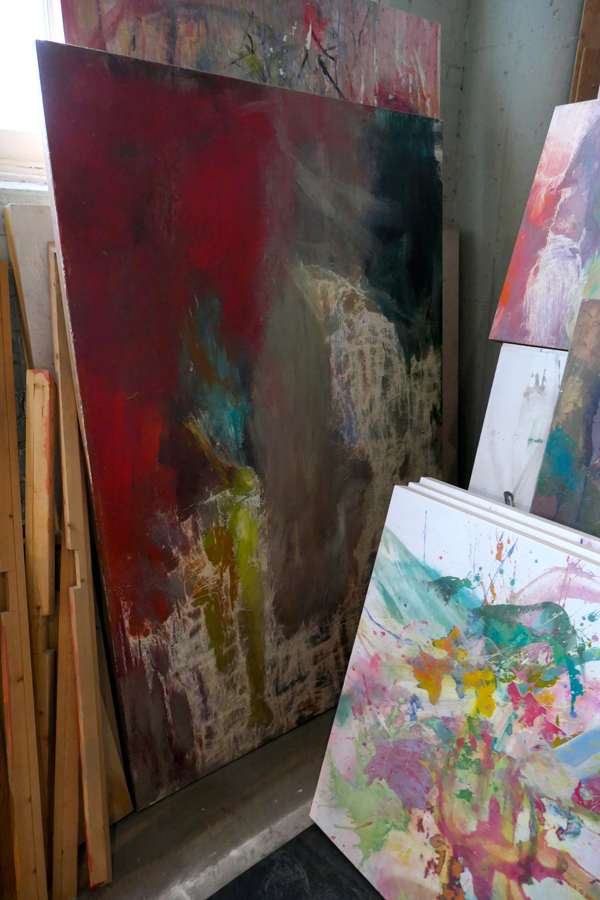
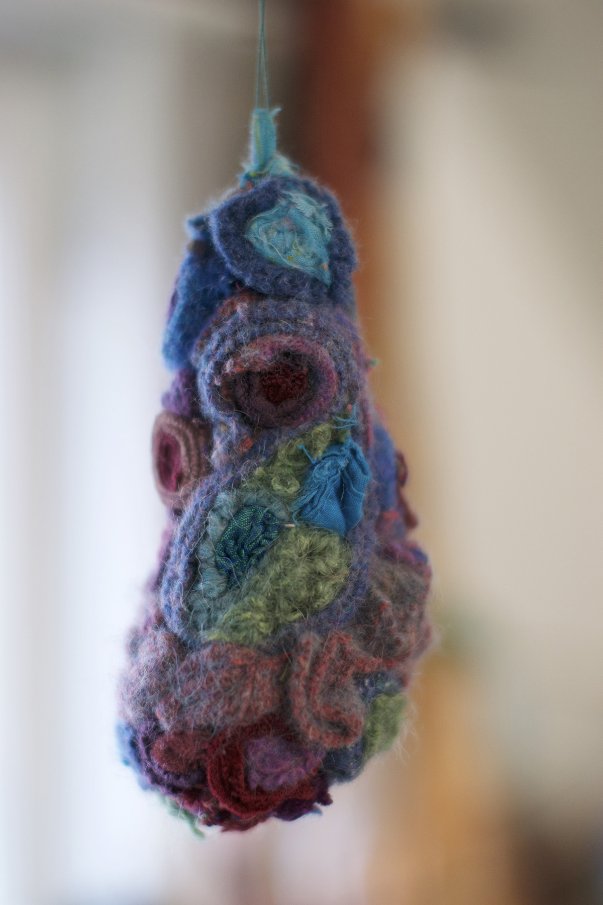
WHEN I FIRST MET Amanda Triplett at an art auction and opening which displayed one of her pieces, I knew nothing about her other than that she makes sculptural fiber works and installations from salvaged textiles.

There was something distinctly puckish about her, a delicate elf, a teasing sprite, right out of the cast of a Midsummer Night’s Dream (that is if she had stuck with her passion for theatrical performance before she switched to visual art.) Enough to trigger my curiosity, in any event, and so last week I visited her studio.

Little did I know. This young mother of two has a laser-sharp eye on our preoccupation with our bodies, society’s ways of manipulating female (and increasingly male) confidence through issues of body image and function. A devotee of the erotic expressionism of Austrian painter Egon Schiele (1890 – 1918), her sculptures lack any of the shyness associated with the elfin folks.


Nor their diminutive size, which Shakespeare hints at:
“they do square, that all their elves, for fear,
Creep into acorn cups, and hide them there.”
The works do have a puckish wit about them, though. How else would you describe a series of imaginary female organs, including Hysteria and Plasma, the former appropriately shaped like a giant vibrator?


Or the tactile, sculptural nest (maybe an acorn after all, if not the womb) that invites visitation? A hint of veneration of the sanctity of female function right next to pointers to the harm inflicted by misogyny.

The striking ambiguity in surface and form allows for multiple interpretations. If you didn’t know the intent behind some of these works, you might just look at them as intricately sewn sculptures, with frequent reddish color combinations, the occasional shocking pink aside. They invoke some vaguely biological forms, patterns that can be equally associated with tide pools, oceanic life forms, or even cellular biology.


Which takes us back to our own bodies. Recent larger works represent imaginary layers of skin, their lace-like perforations raising questions about directionality of flow.


Do they allow the poisonous pressure of body image-standards to be absorbed, or do they allow parts of the self to flow out towards connection with the other? No blood-brain barriers here, but rather contemplations about our relative place in the world.
*
TRIPLETT HOLDS A B.A. IN Art and Art History from Sarah Lawrence College in NY. Starting out as a performance major, she soon switched to visual art, mostly focussed on drawing and other works on paper.
She credits the fact that she was raised in fabric-rich societies like Egypt and Taiwan, with parents later living in India, with her eventual settling on fiber sculptures. Her intention to work with discarded materials found the perfect source: Shortly after she moved to Portland from California in 2016 she was awarded one of the artist-in-resident spots at Glean, “a juried art program that taps into the creativity of artists to inspire people to think about their consumption habits, the waste they generate and the resources they throw away.” They work in partnership with Recology Portland, Metro, the regional government that manages the Portland area’s garbage and recycling system and crackedpots, a nonprofit environmental arts organization.

The two strands of environmental consciousness and gender issues run in parallel, just as the sculptress’ work is alternating between small and large, universal and/or site specific.


Lately she has begun to incorporate some performance aspects into her shows, sewing herself in into a sculpture in front of audiences, and then cutting herself out again, adding rings and layers of fabric per performance.

An element of chanting, coming out of her meditative praxis, is explored as well, guided, as she frequently repeats in our conversation, by the heart. It might be a big and busy heart, but it is matched by an incisive brain.
*
“The past is never dead. It’s not even past.” – William Faulkner, Requiem for a Nun (1951)
OF COURSE NOT, all we have to do is re-invent it. Just ask Triple Candie. Their current exhibition at the Portland Art Museum, Being Present – Revisiting, somewhat unfaithfully, Portland’s most experimental art experiment, the Portland Center for the Visual Arts (1972-1987) does just that.


The duo of Shelley Bancroft and Peter Nesbett (collaborating for this exhibit with Sara Krajewski, the Robert and Mercedes Eichholz Curator of Modern and Contemporary Art) creates exhibitions about art without art, their statement reads. I beg to differ. There is a lot of artistic creativity involved in the way they problem-solve around issues of representation. How do you, after all, depict what went down across two decades at an art hub founded by three artists/academics, Michele Russo, Mel Katz and Jay Backstrand who had the vision to bring avant-garde, contemporary art to Portland? In particular, how do you represent the performance history ushered in by Donna Milraney in the 1980s, which superseded the focus on painting and sculpture in the 1970s under Mary Beebe’s leadership?


One of the ways that people solve problems includes the use of analogies. As it turns out, that only works if people do not cling to superficial features, but focus on the structural aspects of a problem, the underlying dynamic that needs to be captured in an appropriate analogy. Triple Candie did just that when using carefully crafted, individualized tapestries that are analogies of the PDX appearances of post minimalist dancers, jazz and electronic music musicians and performance artists. (In the context of today’s focus on textiles, this is the part of their exhibition that I’ll describe.) Small accompanying plaques inform the viewers about the name of each performer, the date of their performance, their artistic approach and a bit on their life story.


Mounted on walls and suspended from up high across a large space in PAM’s Contemporary Art wing above an orange stage, these fluttering, somewhat insubstantial fabric rectangles hint at the impermanence of single performances. Each one was carefully designed to bring out dominant characteristics of the performing artist they represented. What would I have given to be a little mouse in the room where the curators brainstormed for ideas of typicality, and then set out to transform them into surrogates with wit at times bordering on sarcasm, at times on idolatry! Lovingly detailed, patterned textile portraiture. You should go and give that exhibition a look. Some of it might have you in stitches.