I cannot think of another time of the year when the landscape around us is as intensely, profusely patterned as it is now. Billowing patches of wild flowers, carpets of fresh grasses and nettles, whole seas composed of lupines and chamomile, color and form and bees wherever you look. Blooming, buzzing confusion comes to mind, when you blink at it, but that is of course a quote by William James published in his 1890 Principles of Psychology and referring to babies’ perception. (And boy, did he get it wrong, as we now know 130 years later. Infant perception is fit from the get go.)


I know, I know, some will argue that the color carpets of autumn’s fallen leaves match the spring profusion, or that the geometric lines of wintery, stark, leaf-less branches are prime examples of pattern – please don’t. Just leave my May enthusiasm unchallenged! Uncurbed enthusiasm is what I need right now. Lest you want me to resume uncurbed wailing about politics and administrative utterances of human capital stock ready to work... No? Thought so.


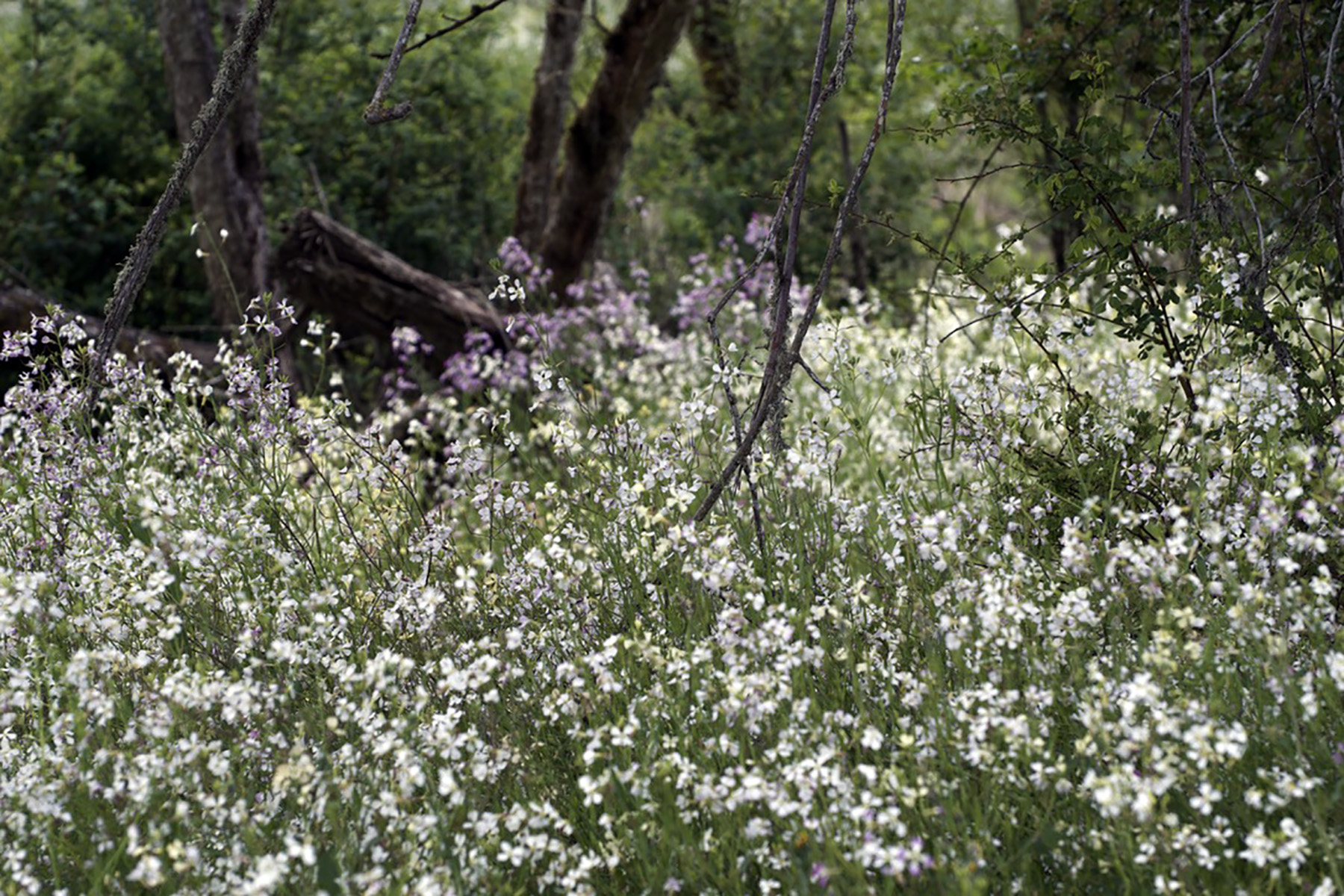
I do not know some of the plants I photographed last week, identification welcome. But I thought it would be fun to juxtapose the billowing forms with art that is the opposite – exacting geometric lines, connected to nature as well, in some ways, or just connected to the world as photographed.


I am talking about the embroideries of Dutch-born, California-based Natalie Ciccoricco, who has a wonderful eye, a steady hand and in some of her work a deft sense of humor (as well as on her website where she goes by Mrs. Ciccoricco. At least I assume that is meant as a joke.)
Her most recent series of embroideries on recycled aper used found twigs and branches, encasing them in geometrically refined line patterns with a remarkable sense of balance. Here is a page where you can see the diversity within that body of works (Nesting).


I had first seen her images of circles – a series called color holes – embroidered on old photographs or landscapes, vintage postcards, images of SF houses etc., which struck me as creative in the radial pick-up of the color palettes.


They are also artful in the sense that they shift the spatial relationships while adding an eerie artificial element. Fabric artists are really seeing a renaissance, don’t they.
So, juxtaposing the straight with the diffuse, the carefully selected palette with the organically haphazard one, craft with nature – I think we have busied our eyes enough to allow ourselves to forgo reading the news. (Ha, got the hint at politics in twice!)


And music, what else could it be, will juxtapose the violin with the piano, in Beethoven’s Spring sonata (# 5, Frühlings-Sonate.)


