The weather gods were grumpy on Monday. No amount of pleading stopped the wind and pouring rain. They relented on Tuesday, a good thing, since it was the second and last day for the circus in town, slated for an outside performance. Not only that. It enabled the students of the McClaskey Culinary Institute at Clark College to shine and show off what they learned during the two-year career program in culinary management.

Alex Zavala Contreras
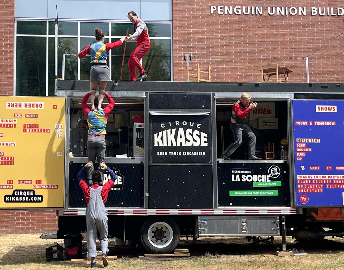
All this was made possible by an extraordinary collaboration organized and nurtured by the Clark College Foundation. Ruth Wikler, the foundation’s inaugural Director of Arts Programming, Partnerships, & Philanthropy, has extensive roots in the circus world. She invited Cirque Kikasse, based in Quebec, to bring their unusual mode of operations to the Pacific Northwest. The small band of highly talented acrobats works out of a food truck, which serves its original function before and after the show. It transforms, with the help of a few props and a trampoline, quickly and seamlessly into a stage for an energetic repertoire of juggling and acrobatics, in, under and on top of the truck.

For the first time in its history, the circus was joined by students training in the culinary arts. They developed the dishes and drinks to be served, and tended to the lines of hungry spectators, eager to grab a bite before the show. Chef Earl Frederick, the Director of the McClaskey Institute, and Service Lead Lucy Winslow were on hand to supervise and cheer on their charges.

Chef Earl Frederick

Lucy Winslow
The poutine, filled with either beef or mushrooms, was a hit, and the special drink (the usual beer for which the truck is known not served to campus students) was visually enticing – the capstone project of graduating student Alex Zavala Contreras. I should have tried it all, but had my hands full with the camera…

Alex Zavala Contreras

Students at the Clark College program have benefitted from a transformative gift by Tod and Maxine McClaskey that revamped the facilities and allows learning in state-of-the-art teaching and dining spaces, serving food to people on campus as well. The interdisciplinary encounter of these students with the arts is a next step up in reaching out to the community. By all reports, the collaboration was very much appreciated by participants from all sides.


I have always strongly believed that student participation in interdisciplinary settings opens minds and activates curiosity about the world that eventually feeds back into motivating a deeper learning of one’s own discipline. It brings people together as well, strengthening community. And in this case it made the artists quite happy, getting a break from working the bar/windows before a physically challenging performance.
***
Cirque Kikasse was founded by Hugo Ouellet-Côté and William Poliquin-Simms who have both decades of circus acrobatics and management under their belt. The idea of a self-contained truck that can travel across North America and provides entertainment and services for people’s festivities, parties, events of any kind, is both brilliant and pragmatic.

You don’t have to erect tents, schlepp endless structural parts, rent trucks etc. to be able to perform. You can feed people or ply them with special brands of beer even when the weather is so bad that you are unable to perform.

Should I get clothes matching my car?

William Poliquin-Simms

Hugo Ouellet-Côté
But the curiosity of that kind of “stage” should not draw our attention away from the actual performances. The 5 members of the crew who I was able to observe, were accomplished in their interactions. The show has assigned characters to the acrobats which require some acting, a funny story line here or there. It is choreographed to grab your attention for any one of the artists, when the others need a breather, or time to set up. There are occasions when pauses are filled with jokes, somewhat muted ones last Tuesday clearly geared to the audience – I assume some more political fireworks are in the repertoire when appropriate.

Left to Right: Hugo Ouellet-Côté, William Poliquin-Simms, Antoine Morin, Jérémie Saint-Jean, Adèle Saint-Martin. (I hope I got the names right!)
Of course the physical skills, the bravura when it comes to balancing acts 35 ft in the air on towers of rickety chairs tall, outshone whatever pleasure was derived from the contextual actions, slap-stick or the considerable showmanship during set – up of the actual acrobatics. They know what they are doing, and they are doing it very, very well.

It was not just my heart – that of a veteran circus goer – beating faster, as it turns out. The audience around me was rapt, and you could basically hear the communal intake, holding and then releasing of breaths when some particularly risky feat up in the air was safely accomplished. Some people had never seen a live circus before, as I overheard. Kids were already practicing their climbing skills, ready to join…


Antoine Morin 35 ft in the air.
There is something magical and unique about outdoors live performances (free ones at that – thank you Clark College Foundation!), when spectators are not confined into seats, able to shift vantage points, able to congregate with large groups of friends and enjoy their food.

I think I felt that doubly so given my own longing to experience live performances of any kind. Since the pandemic I have not been able to visit concerts, theater, or any other event with a large public inside, and have missed it deeply. It is simply different to see something in the moment and feel the connection to the emotions or reactions around you, than to watch even the best footage alone on a screen.


Jérémie Saint-Jean

Adèle Saint-Martin
I have written about circus before – its function, its promise, its idiosyncratic role as an art form. This week a different thought was prominent when I saw these artists push their physicality to extreme borders. Perhaps it was triggered by the ongoing discourse about physical power and masculinity in this country. Or by the fact that it is explicitly linked to military prowess by those in the administration concerned with and enthused by war. (Which is absurd, isn’t it, when war fare no longer depends on personal combat, but the ability to steer a drone or maneuver a jet…)

Physical strength and agility in the context of (imagined) masculinity is often associated with power – with dominance, prerogative, supremacy. The physical power that I observed in Tuesday’s circus performance – by both men and woman, no less – had none of those characteristics. It was tied to joy, the sheer joy of pushing boundaries, pulling some impressive tricks out of the hat comprised of all of those muscles, sinews, bones and brains tuned into precise and timed movements.
Flexibility ruled, not rigidity.
Coöperation made the feats possible, lightyears away from competition, so often found in the (sports) arena where we usually get to watch physical prowess.
What a difference. What a relief. What a treat!


Let’s hope they return soon, to better weather for the entirety of their stay.